Politics and Transit Maps
Harry Beck and the terrifying erasure of West Berlin
Schematic transit maps are probably one of the world’s most successful and iconic pieces of design. They’re transparent, tourist-friendly and memorable. You pick one up and you just know how to use it.
The simplicity that goes into modern-day schematic transit maps was a trend, if not Law, arguably started by Harry Beck. An engineering draftsman, Beck turned the concept of the tube map on its head, which until then had been geographically faithful but caused problems in areas where multiple lines and stops converged, such as the centre of London.
With the surgical precision of his drawing tools and the clarity of his engineering mind, he redrew the map into a shape so timeless it remains instantly familiar to Londoners today. Between the crisp coloured lines of his schematic and the clean use of space, Beck effectively placed a magnifying glass on the centre of London, allowing for more detail in the regions with a higher density of stops while compressing distances in the farther ends of the Tube.
Beck’s design was so phenomenally popular it became the de-facto standard for transit maps around the world. Also, by diminishing the effect of distance from the centre of London to its outskirts at the time the map was drawn (the 1930s), Harry Beck also conceivably lit up urbanisation on the fringes of London; he planted a subconscious seed in transit users that distances weren’t necessarily so large as to absolutely require living in the middle of the city.
The same principle can be just as easily transferred to wider geographies to expose areas of economic importance or population density. Switzerland, for instance, enjoys the benefits of a highly developed (if expensive) railway network criss-crossing the country. However, the vast majority of the people living in Switzerland do so on an axis that goes from Zurich to Geneva. The mountainous regions in the centre of the country preclude urban development. The Italian part of the country is also rather isolated from the rest as a result - a train journey from Geneva to Zurich can clock in under two hours and a half, where from Geneva to Lugano would take you upwards of five hours. A schematic representation of Switzerland’s pivotal railway lines would have to be weighted on this axis with branches extending to serve local communities in the mountains.
Maps that deviate from Beck’s design are rarely as successful. After years of a familiar and intricately designed Metro map for Madrid, in 2007 the designers eschewed diagonal lines, creating a vertical capital city with horizontal criss-crossings. It lasted a good 6 years, to its credit, before being scrapped completely in favour of a Beck-style design in 2013.
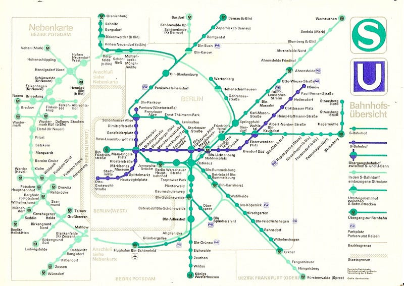
The simplicity of schematic transit maps lends itself as a lens into urban geography as well as a hammer and chisel. One, albeit light, example was Beck’s representation of a larger London. An insidious example would be the transit map for Communist East Berlin. Without much examination, the transit map looks vaguely familiar to Berliners, with some stops that still exist and some S-Bahn shapes that remain. But on closer inspection, you realise that West Berlin is disproportionately - laughably - reduced in size. An inconvenience in the middle of the bustle of Socialist life, a cartographic slip of the hand. It speaks volumes about the crude reductive reasoning employed by the Soviet bloc.
Harry Beck’s simple principles have the power to reshape urban geographies. East German socialists took this freedom to the extreme. An enclave with upwards of two million people, compressed into irrelevance. Ethnic cleansing on paper, where the writers of Socialist history preempted the victory that would fortunately elude them to start rewriting the facts.


